
Understand
Context
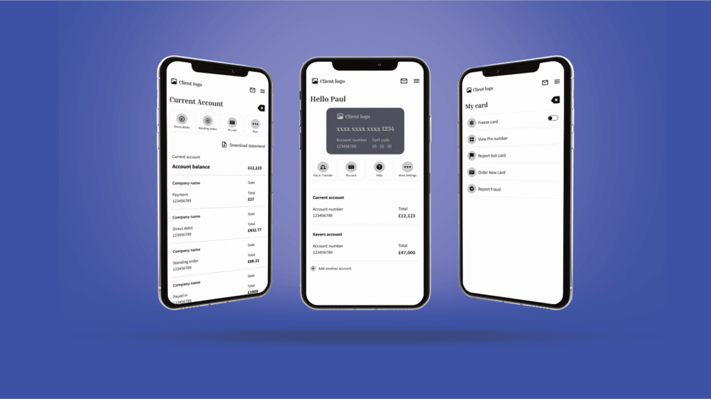
The mobile app had become cluttered and inefficient, causing users to struggle with simple tasks like checking balances or sending money. Key flows involved too many steps, leading to delays, user frustration, and increased customer support queries.
Challenge
Redesign the mobile banking experience to feel fast, modern, and secure, reducing friction without sacrificing functionality or trust.
Define
Client Goals
Streamline core banking tasks to improve speed and completion rates
Reduce support queries by simplifying navigation and interface clarity
Surface underused features to increase user engagement
Deliver a confident, mobile-first experience in line with fintech competitors
Primary Users
Adults aged 25 to 45
Digitally fluent, use mobile as primary banking channel
Often multitasking between work, family, and financial tasks
User Needs
Complete common tasks (like sending money) with minimal friction
Easily check account details at a glance
Feel confident navigating and securing their accounts on mobile
Ideate
UX Strategy & Key Improvements
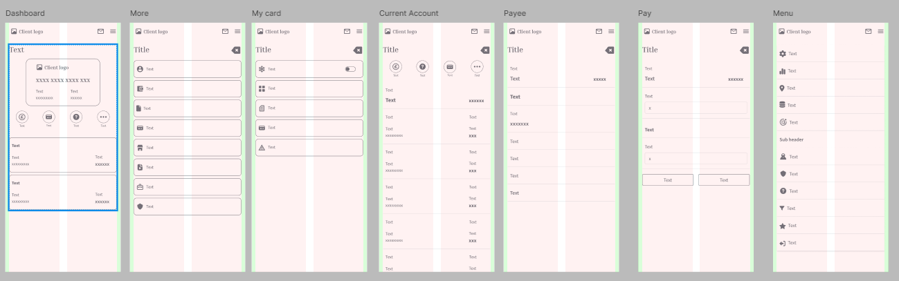
Streamlined Transfers: Reduced steps from 5 to 3, with pre-filled recipients and predictive defaults
Bottom Navigation Redesign: Reorganized key sections for faster access to balances, transfers, and transaction history
Progressive Disclosure: Kept advanced controls hidden until needed to reduce cognitive load
Modern Visual Language: Simplified UI, consistent icons, clear hierarchy, and secure interaction feedback
Design Enhancements
Dark Mode for night-time users
Biometric Login (Face & Fingerprint ID)
Quick Actions are configurable from the home screen
WCAG-compliant accessibility updates (scalable type, contrast tuning)
Push Notifications for transaction updates
Validate
User Testing & Results
Conducted moderated testing and surveys with target users post-launch
Highlighted improvements in task speed, flow predictability, and trust perception
Key Metrics
38% faster task completion across transfers and balance checks
31% drop in support queries tied to transaction issues
SUS Score: 82 Rated “Excellent” for usability
24% increase in feature usage, especially around scheduled payments and filters
User Feedback
- “So much faster to do the same tasks.”
- “Looks cleaner, easier to navigate.”
- “Biometric login makes me feel more secure.”
Deliver
What Was Delivered
Mobile UI for iOS & Android
High-fidelity Figma prototypes
Modular design system for scale and accessibility
Design and interaction specs for front-end teams
Assets adapted to MUI-based design library
Tech & Collaboration
Frontend: React JS, Material UI, MUI
Backend: Next.js, PostgreSQL, AWS, Firebase
Agile delivery via Jira + Teams
Worked closely with PO, front/back-end devs, QA, and stakeholders to ensure alignment and delivery quality
Reflect
The redesign delivered measurable improvements in speed, satisfaction, and adoption. By balancing clean UX patterns with accessibility and trust-building details, the app now supports confident, frictionless banking for daily users, driving both user retention and business value.
Book a free 30 min call
Let’s have an honest conversation about what’s holding your product back. Whether it’s user friction, unclear priorities, or low engagement, we’ll help you unpack the issues


Copyright © 2025 | Afirix
Book a free 30 min call
Let’s have an honest conversation about what’s holding your product back. Whether it’s user friction, unclear priorities, or low engagement, we’ll help you unpack the issues
Copyright © 2025 | Afirix